Monday, April 28, 2014

Gallery of Exploding Boxes

From time to time, a prospective customer will ask to see examples of exploding box designs that I've done in the past.  I have posted most of them here in the past, but since they are scattered around, I thought it would be easier to put them all in one post that I can direct people to if they want to see some of my past work.  Think of these as examples only- most of my work is custom, so I am tailoring a product to the particular person who is ordering it.  I prefer to work with each individual customer on the design of the box they are ordering so that I know that they are getting exactly what they want.

First up: a zebra-print box for a pre-teen girl:


This was the very first exploding box I made!  It was for a friend of my daughter who was having a birthday.  Her favorite colors were turquoise and purple and she loved animal prints.  I had my daughter give me cute one-word descriptions of her friend, and printed them for the inside panels, along with a Happy Birthday message.  My daughter made the origami box in the center to hold an ornament with her friend's name on it, since her birthday was just before Christmas.

This is my first graduation box, apart from the prototype that I never took pictures of.  When I got the idea to do a graduation box with a lid that looked like a graduation cap, I researched ways to make the box appear more round, like a real hat.  That led me to experiment with making an 8-sided box that, while VERY dramatic in presentation, is more labor-intensive than it is worth, and as such, I do not make these anymore.  More about the decision to discontinue those here.


And here is another one.  The student that this one was for was a varsity swimmer, and I was asked to incorporate that somehow into the box.  I found a swimmer graphic for that.


Don't get me wrong, I LOVE the look of these, I really do!  They are SO much work though.  If I charged what it actually cost me to make them in terms of supplies and labor, they would be so expensive, no one would buy them.  That is why ultimately I transitioned to offering the square graduation boxes only.

Here is one of those:


And another:

And another recent one.  For this one, it was requested that I add some graphics to represent the personal interests of the student, who is an avid reader, had authored her own book, and planned to pursue a veterinary career.
I used a book graphic, and as the students' mom requested, I even added the name of the book that her daughter wrote to the cover.  Other graphics include a veterinarian symbol and the high school logo.

(Now, having looked over the last few graduation boxes I've done, I'm wondering if there are any schools out there that have school colors other than red and/or blue?!)

This one is a repeat customer- she purchased the red/blue octagonal box a couple of years ago for her niece.  Now her nephew is graduating, and I made this for her:


This one had more personalization in it than any other box I've done!  Her nephew is quite an active guy: he swims, plays soccer and tennis, loves music and Colombia, so she wanted all of those things represented, in addition to the symbols for his high school and the college he will be attending.  Boy, was it a challenge for me to incorporate all of that!  I did it though, and I think she is happy with it!  Here's a close-up:

And, finally, I got an order for a graduation box that is NOT red or blue!  I was so excited to work on this one!   No custom graphics on it, just school logos, so pretty straightforward, and I was able to complete it in a couple of days.
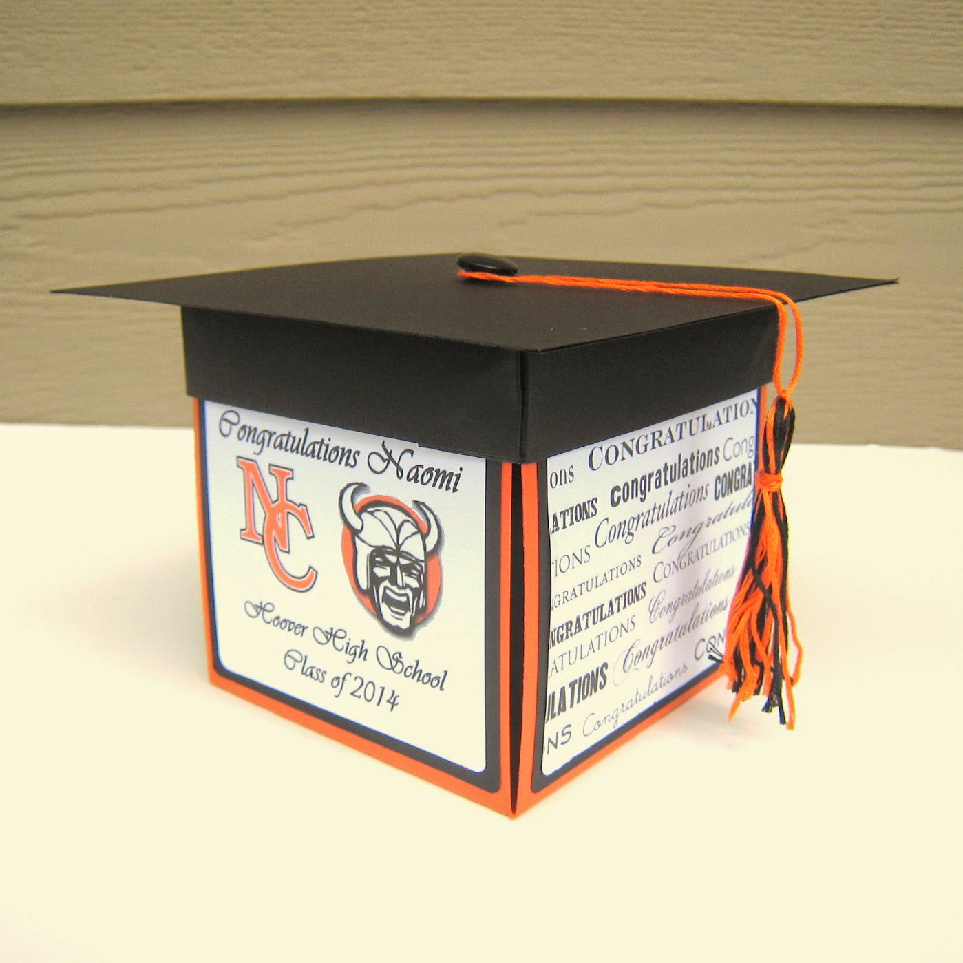
Incidentally, those were my high school colors as well, though it has been a loooonnnggg time since I was in high school!  Nowadays, when I see orange and black, I think of the Oregon State Beavers!

Here's another one that is a little different.  The graduate is headed to Harvard for college- wow!  Her mom, who purchased the box, asked that the center layer be crimson, which is Harvard's color.  I wanted to use the Harvard logo in this box, but their PR page was pretty specific that that was not allowed, so I just used the red, and added sentiments that her mom asked for.  She also wanted a blue lid instead of the black, because that's the color of the high school's graduation caps.


Now here's one that is a little bit different.  Not only are the colors ones that I have never used before in a graduation box (hooray for something other than red or blue!) but the customer wanted to have a holder for rolled up cash bills.  At first, I thought she meant standing up rolled bills, so was thinking of making a tube, similar to a toilet paper tube that the rolled bills could stand up in.  She wanted the rolled bills to lay down though, so I suggested a shallow box to lay them in.  She was happy with that idea!  In order to fit the box, I had to remove the inside layer of the box, so it only contains the larger two layers.

Here you can see the box in the center, where the rolled bills would lay.
I liked this project, because it was something different!  I think the customer liked it too.  I really enjoy making products that exactly match what the customer expects- their happiness is my ultimate goal!

New for the class of 2015.  Since I got a Silhouette Cameo for Christmas, I have revamped my design, and the layers now lay much nicer together!  See the 5th one down and beyond for examples.


Here is the first one I made with my new Silhouette Cameo. Notice how the inner layers now lay exactly diagonally instead of just barely offset.

This next one was one where I contacted the university to ask for permission to use the logo, but they never responded.  Sadly, this is not uncommon.  The customer suggested using the heart graphic, and I also used a dimensional graduation cap sticker on the front panels.


 This is another one that I had to use non-university related graphics.  I emailed the licensing office to ask permission to use the logo, but after 2 days I had not heard back, and as this was a time-sensitive order, I had to proceed without it.  I used some general graduation graphics instead, as well as a font that is close to the one used by the university on their website, and I think it still came together nicely.  Ironically, the day after I shipped the order, I got an email back from the licensing office, but of course it was too late to do anything then. My customer seemed happy with what I came up with anyway.

 I really like this next one- the customer asked me to make the lid green, because the actual graduation caps that the students wear are green.  This is only the second one I have made a non-black lid- I like it!


Now, onto some of the more creative boxes.  Last year, while poking around in the floral section at Michael's, I stumbled upon these cute little terra cotta plant pots that are just 2.5 inches high or so.  Adorable!  I wondered if I could create a little flower arrangement in one and put it in the center of an exploding box.  This was my first experiment with that:


I put a variety of different flowers in this pot, and also added a "floating" butterfly and dragonfly, which are attached to thin strips of acetate.  Not pictured is a little sign that I stuck in the pot that said "Happy Easter".  I just sold this box a few weeks ago at the Jane Austen Faire- the woman who bought it said she was going to her sister's for Easter and planned to bring it there.

This was my next garden box.  I decided I wanted to go with a theme, and picked daisies, because I had some lovely yellow and blue daisy paper.


I love this one!  I will tell you, though, those daisies took FOREVER to make!  There are at least a dozen in that pot, all individually made with a daisy punch and mini-pompons that I had to ink with yellow pigment ink, then hot-glued to a floral wire.  Love the result though!  I sold this box last year at our Salem Etsy Team spring sale, for a Mother's Day gift.

This one was a custom box, requested by a frequent buyer for his girlfriend's birthday:
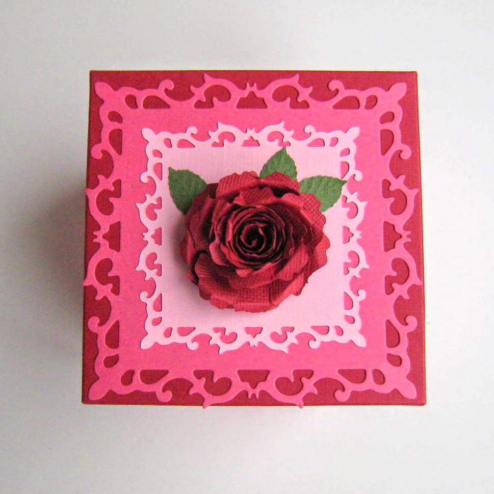


For this one, I was asked to make it in reds and pinks, and that was all the instruction I received.  I came up with the rose theme on my own, based on those colors.  Like the daisy box, the roses in this one were quite a lot of work.  These were made with a 3D rose die, which punches out a sort of a spiral shape that you then coil to form the flower, then hot glue to keep them intact.  They are very small- only about 1/2 inch to 3/4 inch wide each.  They are hot-glued to floral wire for the stems, and again, there are at least a dozen in this box.  I really like how it came out though, and more importantly, my customer did too!

This is a Mother's Day box that I made in 2013 but didn't list in my shop until recently:


This one is much simpler than the ones with the pot, still pretty though.

And this is my most recent creation.  This one is brand new for Spring 2014:


This mum-themed box was inspired by the colorful washi paper with the mum pattern on it.  I love washi paper- it is one of my favorite mediums to work with, but I've never used it in an exploding box before.  This was one of those ideas that came to me and I just HAD to make it!  I have to say that it turned out at least as well as I had imagined it.  I used the mum paper on both the outside of the box and on the middle layer of the inside.  On the larger inside panels, I used a mum embossing folder to create the nice textured panels that you see in green.  There are a couple of blue 3d mums on the inside layer, along with two panels with "Happy Mum's Day" text- since, you know, Mother's Day is coming up.  (Clever, right?)  Finally, the pot of mums in the center.  These are made by layering different sized punched daisies together.  I used larger flowers than in the daisy box, so there are fewer in this one- just 3 larger flowers, and 4 smaller ones, but the effect is still a nice, full bouquet.

This is a recent custom order that I made for a customer who tracked me down at the Jane Austen Faire last month.  She remembered me from the previous year and wanted to find me to order a custom box for her daughter's 18th birthday.  Her daughter is in the military and likes the color turquoise, is not a girly-girl, is athletic, and loves to read.  This is her box:


This one is different that my usual style, but that is OK- I enjoy doing something different!  The customer who purchased this is very happy with it and feels that it reflects her daughter's personality well.

A Mother's Day box, for a mom who is into Tae Kwon Do:


I mixed some pretty red washi paper in with the martial arts imagery to soften the look a bit and make it pretty.  Every mom needs some pretty on Mother's Day!

Another floral box using Japanese washi paper:


And here's something new- an exploding box with a gift card holder in the center!


This next one was a custom order for a customer who wanted to send a nice gift to a friend, who is a hard working FT working mom of a toddler.  Boy, do I remember what THAT was like!  She sent me photos of her friend and her family to be incorporated into the box, and wanted bright, cheery colors like orange and yellow.  I chose this Chiyogami washi paper because it had just the right colors and is very cheerful.  I think it turned out great!


Here is a recent custom order for a Valentine exploding box.  I worked very closely with the customer, as she had a lot of very specific things she wanted to include.


As you can see, there was a lot of text that I was asked to incorporate, and I got to really test out my Silhouette Studio software!  I learned a lot by doing this project- as the ideas came to me, I researched how to create what my mind was seeing, and in the process learned things I had not known before.  That is what I love about custom orders- they really make me think outside the box (pun intended!)  This one had some neat things- word wrapping around a shape, some cool polygon fill effects, and it was another opportunity to make word collages, like I did in a previous project.  The feedback I got from the customer when she saw the photos was very positive.

Here are some highlights from the graduation season 2017:


 Note the new cash holder that I added this year! (2017) It has been pretty popular!

Also this year, I am expanding to add customized wedding exploding box cards! This is the first- I made it for a wedding I am attending, and it is made in the couple's wedding colors. I also included a quote and bible verse that they included on their invitation. I am really excited about this one, because I got to try adding reactive foil accents! It's hard to see in the photos, but the gold paper is a shimmery gold, and the panels that are printed in gold are the ones with the foil.


These are not the only boxes I've made- there have been others, mostly graduation boxes,that are similar in style to the ones I've shown here.  I've also done a couple of holiday-themed ones, but I am still working on that concept, so haven't yet made one that I'm ready to put "out there".    Anyway, my goal here was to have a gallery of examples of boxes that I can easily point customers to when they want to see what else I've done.  Hope you've enjoyed browsing!

Sunday, April 27, 2014

"Mum's" Day Exploding Box

As mentioned in my last post, I found this great washi paper with multi-colored mums on it.  So pretty!  I made some cards with it, but then had the idea to make a mum-themed exploding box with it.  What better occasion than for Mother's Day, right?  Right??

There are so many pretty colors in the washi paper that it was hard to narrow down which ones to use in the box!  Well, besides the limitations of the Michael's card stock supply.  I went with a pink base and used blue and green accents.  The mum on top of the lid was made by layering different sized daisies from a Sizzix die, simply called "Flowers, Daisies", and one (the smallest) from a daisy punch.  I like it-the daisies are sort of ragged and imperfect.


Surprise- a pot of handmade paper mums in the center!  There are also two blue mums on the inside panels that you can't see very well in the pictures.  The other panels say "Happy Mum's Day"...yeah, I know, sort of cheesy, but hey, it's cute!  The one thing I did not think of was to leave a panel blank for a written message, so I may remove one of the blue mums for that purpose.  Anyway, I liked how the pot of mums came out.  There are two different sizes of flowers , 3 larger and 4 smaller. This was much easier to do than the daisy pot I did last year, or the rose one from a few months ago, which had at least a dozen individual flowers each.  They were small though, so what I have figured out is bigger is better!  You still get the look of a nice full pot of flowers but without quite so much labor!  These are made by, again, layering punched daisies of different sizes, which are then hot glued to a metal wire.  The wire I found in the floral department is covered with a green fabric-type stuff, so they look like flower stems. Those are stuck into a halved round Styrofoam ball that is sunken into the pot and hot glued so that they don't pop out.  Once the flowers are secured into the pot, I added shredded green tissue paper.  The pot is hot glued to the center of the box.

I won't be listing this in my Etsy shop, at least not yet- I wanted to have 3 exploding boxes to display at the Salem Etsy Team Spring Craft Faire, which is next Saturday.  If it doesn't sell there, I may list it in my shop then.

Speaking of the sale next weekend, I still have lots of things to do to prepare!  Most of my display props are still packed up from the Jane Austen Faire, but I still have things to do like print and cut coupons to give away with purchases, make some sentiments that can be added to the front of cards, and make sure that I have all the price signs I will need.  Guess I better get cracking- only 6 days til the sale!

Saturday, April 19, 2014

Spring Happenings

Hello!  I have been so busy preparing for my spring craft sales that I haven't had time to post about them!  The first one, the Jane Austen Faire, was April 4th and 5th, and it was a huge success!  It was bigger and better than last year, and though it was an exhausting couple of days, it was SO much fun!  I invested in some new props for my booth, and I was really happy with how it turned out.  I shared a 10x10 space with a fellow Salem Etsy Team member, and since we were on a corner, we opted for a L-shaped configuration, with each of us taking an arm of the L.  This is my side:

I used a 4-foot table (on the left) along with a 3-foot wicker basket, which I raised up with 2 plastic milk crates covered with a tablecloth.  Also, check out the far left- I found that great spinning card rack at my local Goodwill store for only $14.99!  I was SO excited about that find!  It really saved space, especially with the rest of my display being a bit cramped.  I got lots of great feedback on my setup though, and it was a great experience.  (By the way, the bright red backdrop was not mine- that's the canopy from the booth behind ours.)

So, next up is this:
This will be my third Salem Etsy Team spring sale- the very first REAL craft sale I did was the 2012 sale.  I am really excited for this one.  Our sale last year was a bit slow, I think because we picked a venue that was off the beaten track.  This year, we are having it at the same place we did our most recent holiday sale, which has much better foot traffic.  Our spring sales tend to be the busiest ones, probably due in large part to being so close to Mother's Day (we schedule it that way on purpose.)  We had flyers available at the Austen Faire to promote the sale, and a TON of people took them, so I have high hopes that we'll have lots of shoppers!  We have a fantastic lineup of vendors, we are buying an ad in the paper for more exposure, so I have a good feeling about it!  I will have lots of new cards, and a few exploding boxes too.  There's this one, which I still have from last year:
It has a "Happy Mother's Day" sentiment on the inside.  I also have an idea for a mum-themed exploding box.  I found this great Japanese washi paper with a colorful mum design on it, which I used in this card:
 I also have a mum embossing folder, so I think I can make something cute, and how fitting for "Mum's Day"!

I also just finished up a really neat custom exploding box order.  I had a customer at the Jane Austen Faire seek me out (she remembered me from last year- how nice is that?!) and ask me to make one for her daughter's 18th birthday.  Here's the thing though: she's not a "girly girl", so my typical floral/butterfly designs would not work.  Well, I am always up for a challenge- I find that forcing myself outside my normal "box" (pardon the pun) expands my creativity, and it's good to stretch your mind beyond your same-old-same-old every once in awhile.  So this project really intrigued me.  The birthday girl is in the military, she's very physically active, loves to read, and her favorite color is turquoise.  This was all the information I was given about her.  When I discussed design ideas with my customer at the Austen Faire, I suggested using one of the camo patterned papers to allude to her military background.  She liked the idea, so I went with it.  I just finished up the box last night, and here it is:
I uploaded photos for my customer to review, and she loved it- I am SO relieved!!  So let me break down the design.  I used a mix of turquoise, black and gray, along with the black and gray camo paper, but the use of that was subtle- the most you can see of it is along the rim of the lid.  It is used as a middle embellishment layer elsewhere, as well as on the stars in the middle, so it's not in-your-face.  I found this interesting stencil font, and I chose it to again allude to the military, though this font is not as boxy as a traditional military stencil- it's curvier and more feminine, a good mix for a young girl in the military.  I found some clip art online of a runner and a book, and used those in the middle layer to represent her love of athletics/running and reading.  Finally, I used some foil star stickers in blues and reds, which are patriotic, and some die-cut stars in the colors of the box.  I left the center blank so that my customer can write a message there.  I really like it, and am glad that I was able to come up with something that my customer is happy with, that she feels really embodies who her daughter is.  That is the highest compliment I could receive!

Here are a few new cards that I'll have available at the SET spring sale on May 3rd:


I have really enjoyed using the most recent washi papers that I have found- such great, vibrant colors, and so fun to work with.  I sold several at the Austen Faire, so will be making a few more to bulk up my inventory for the SET Spring Sale.  After that,  I will be ready for a break, and my husband will be ready to have his pool table back!


Saturday, February 15, 2014

Looking Ahead...

Well, Valentine's Day has come and gone. And though the last 2 years my Valentine's Day cards have sold well, this year...not so much. As in....NONE.  How depressing- right??  I don't get it myself, but there have been a lot of changes at Etsy this last year.  I can only guess what that might mean for small-time sellers like me.  My views were WAY down, and my sales (apart from the fantastic custom order I posted about previously) sucked.  Welcome to the new Etsy, I guess.

In addition to that disappointment, we also had to cancel the Salem Etsy Team Valentine Craft Sale, scheduled for February 8th, due to extreme weather.  Who could have known that we'd get the worst February snow storm in 2 decades that weekend??  We're talking nearly a foot of snow, almost unheard of around here. (Arrghh.)

So, you know, things have not been looking great lately.

But...no sense in looking back- time to move forward!  And the next thing on my schedule:
This is the second year of this event, the first of which, last year, I participated, and it was GREAT.  Last year, it was held the weekend before Mother's Day weekend, and as such, I did really well.  This year, it is a lot earlier, so I won't have the advantage of having Mother's Day right around the corner.  Also, it is a LOT more expensive this time around. Last year, it was only $25 for the booth fee, this year it is $100.  The space is much bigger though- 10x10, and we are allowed to share spaces.  So, I am sharing a space with Megan, my local Etsy team captain, who sells incredible bath and body items in her store http://www.phytotherapy.etsy.com .  We will have to figure out how to split up a 10x10 booth, which I have never done before, so it should be interesting.

This year's event is a 2 day event- a Friday evening, followed by all day Saturday.  So really, the booth fee covers 2 days, not just 1, and I can only hope it will be worth it.  It is hard to know ahead of time how an event is going to go. I have done great sales and really crappy sales, and you just can't know before how it's going to be.  This one is promising, though.  It has a very popular theme, and Amy, the organizer, has some great business partnerships this time, and a very good marketing plan.  Last year's smaller event was amazing, so I can only assume that this year's will be bigger and better!  I just have to figure out how I can fit in here.  Last year, I did well because I sold lots of Mother's day cards.  This year, we do not have Mother's day the next weekend, so I don't know what to expect.  But, I am going to hope for, and prepare for, the best!  One of the things that Amy does to promote the event is do swag bag giveaways, and this year, I am contributing.  I got an idea a few months ago and saved it just for this occasion.

I went to my local Goodwill awhile back, and found an older edition of Pride and Prejudice (which I have to say is my favorite Austen.)   This bookmark features a hand-torn page from the book, along with a pressed flower and some petals and leaves.  It is laminated to protect the bookmark.  I made 25 similar bookmarks in various colors- boy am I tired!  They all turned out great though- for once, my vision was really close to how it came out in reality!

Now I have to start working on other items to sell at the Austen Faire.  This year, I won't be able to rely on Mother's Day items to sell well, since it will be more than a month ahead of that occasion.  I'll plan to have some Easter cards as well as Mother's Day cards, and since it is a Jane Austen Faire, some Austen-inspired wares as well.  I found this fantastic Jane Austen-inspired paper pad at Joann's awhile back, and can't wait to make some stuff with it!
So, my next few weeks will be consumed with thoughts of Jane Austen- check back to see what else I come up with!

Sunday, January 26, 2014

Custom Valentine Card Project

Awhile back, I mentioned that I have a very nice repeat customer who likes to order my cards for his girlfriend.  I did an exploding box card for her birthday back in October, and he reported back to me that she loved it!  Well, the New Year was barely upon us when I got a message from him.  He was already thinking about Valentine's Day, and wanted to order something special for his girlfriend again.  (Is he a keeper or what?!)  My immediate thought was "uh oh..."  He got her a never-ending Valentine card last year, and then the exploding box for her birthday, and those are pretty much the top of my line.  I was pondering ideas on what I could possibly do to follow up an exploding box, when he suggested a mini photo scrapbook card.  What a GREAT idea!  I have never done one before, but heck, I'll try anything once.  (Except haggis.  I have to draw the line there.  But I digress.)

So, a scrapbook...I have never gotten into scrapbooking for some reason.  I guess I like doing shorter-term projects than a huge scrapbook album that takes forever, and that's why I stick to cards and bookmarks.  But this was an intriguing idea, and I felt up to the challenge.  I suggested a standard 5x7 size, and he agreed, but wanted a center page added.  It took me a couple of days to work out how I was going to do that.  I didn't want to use staples, and glue wouldn't be stable enough, so had to figure out some other way to secure a center page.  One night when I was having a bit of insomnia, I started thinking about the possibility of sewing it in, like a book.  It worked out pretty well!  The center page is actually a 2 pages from one folded piece of card stock that is adhered together to create one page.  I sewed in the page before adhering the two sides together so that the stitching is not visible on the inside.  It was on the outside spine though, so I just cut a strip of card stock in the same color, folded it, and adhered it on to cover the stitching.

With the technical aspects taken care of, I turned my attention to design.  I went through my Valentine paper stash and didn't find anything I thought would be appropriate.  One challenge I was facing was the fact that I had already used a red/pink color scheme on the birthday exploding box, so didn't want to do something that was too similar to that.  But it's Valentine's Day, and those are the traditional colors.  I scoured my local craft stores for a paper to inspire me, but came up empty- everything was too cutesy, and I was going for a more elegant feel for this.  I started looking online, and found a paper I liked, and took off from there.

So, here are the pictures of the finished product:

This is the front.  The right panel folds over and ties closed with the ribbon.

This is the first open page.  The sentiment, provided by the customer, says "To the woman who makes my day just by being there".  How sweet is that?!  He asked me to put an area by each photo where he could write a note, so that's what the blank white areas are.
And the second open page.  (Note that I have blurred out the faces to protect their privacy.)  Since the paper I used is pretty subtle with the Valentine theme, I added some fun heart embellishments on all of the pages.

Now, notice that the front has some 3-D roses.  I really liked it with the roses, but it presented a problem of not being able to fit into a standard envelope.  So, like I have done in the past for the never-ending cards, I made a custom envelope, this one 3/4 inch thick to accommodate the roses.


It closes with Velcro, which is what the black rectangle is in the second picture.

So, that's it!  I am happy with it, and when I sent the final pictures to the customer, he said he was very happy as well.  I can't wait for him to see it up close, and especially for his lovely girlfriend to see it!  I hope she likes it!

In other news:
I am working on organizing our first Salem Etsy Team Valentine sale!  We are having it at the same venue that we had the holiday sale, so since I've done the floor plan once, I can use the same one for this sale.  I have always wanted to do a Valentine sale (well, a successful one, that is, unlike the one from last year), so I have high hopes for this one!  Now that I am done with the above custom order, I am busy making new cards in preparation.  A few are listed in my shop already.  Once the Valentine hoopla is over, I will have to start preparing for the 2nd annual Jane Austen Faire, which is in April this year.  Last year's was a huge success, so I am looking forward to this year!


Thursday, January 2, 2014

Odds and Ends from 2013

Happy New Year!  Before I gear up for Valentine's Day and spring of 2014, I have been going back through some of the projects I did last year.  I try to remember to post about most of them so that I have a record and can go back and find pictures and descriptions if I need them, but when things get busy, I don't always remember.  So, here are a few projects I did but neglected to post about at the time.

This is a birthday card that I made for my dad last March.  I actually made a second one for my husband's friend's father, whose birthday was close to my dad's, and we were going to be seeing him, so I thought it would be nice to make him a card.  I have used this blue argyle paper quite a bit, and unfortunately I can't find it anymore. :(  This was also a great opportunity to use the argyle embossing folder that I got awhile back, as well as the diamond shaped Spellbinder dies.


This was a baby boy card that I made for my daughter's best friend's mom, who had a baby boy at the end of May.  I loved the green and blue camo paper when I found it online at Scrapbook.com and was excited to have a use for it!


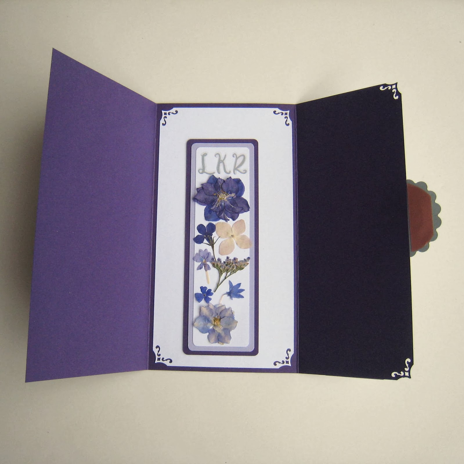
Here was a custom bookmark and gift envelope order.  I love the combination of dark and light purple.


A custom graduation exploding box I did in June.


This is the birthday card I made for my BFF Kendra in October.  I really liked how this one came out!  Love the shades of teal and tan in the floral papers.


This is something new I have been working on in my limited spare time- picture frames!  I have always found it a shame to throw away scraps of washi paper because it is so beautiful, not to mention expensive.  So I decided to try my hand at decoupaging picture frames with it.  I picked up some wood frames at Goodwill, and these are my first two tries at it.  I like them!  I have a good stock of frames, so now just need to spend some time making more!

Here is another graduation box I did in December.  This picture was shot before it was completely finished.  For this one, I tried to get permission from the university from which the graduate was graduating, but no one ever responded to my email. :(  Boo!  Well, my customer seemed happy with the finished product anyway.

So that is a wrap on 2013!  I am looking toward Valentine's Day now, have already relisted my stock left over from last year, and am dreaming up designs for some new cards.  We are going to be doing a Valentine's Day sale with the Salem Etsy Team, and I am really looking forward to that!  Valentine's Day is one of my best selling occasions, and I've always wanted to do a bazaar before Valentine's Day.  (A successful one, that is....which the one in January last year was NOT.)  I have a better feeling about this one!  Our team holiday sale was great, and I think we have an awesome group of sellers who will do a lot to promote the team and the sale.  Also, I just received my application for the 2nd annual Jane Austen Faire, which will be in April.  Last year's Faire was GREAT for me- of course it was the weekend before Mother's Day, so I did really well selling cards!  This year it will be at a larger venue and is more expensive to participate, and it is more than a month before Mother's Day, but I am going to give it a shot and share a large booth with another SET member.  So I will be looking to make lots of new spring items in the near future!


Wednesday, November 27, 2013

Getting Ready For the Holiday Sales

Happy Thanksgiving!  By the time this is posted, it will be Turkey Day, so a happy one to all!  I have spent the day prior to the annual Day of Gluttony looking forward to my holiday craft bazaars.  I try to have a variety of items for sale, and last year we did rather well with the paper ornaments that my daughter Meredith and I made.  This year, I harkened back to a project that I did with my son when he was in kindergarten,and being that he is a senior in high school now, that was quite awhile ago!  That year, we decorated clear glass ornaments with different colored acrylic paint by swirling it on the inside.  It was great, and we made several ornaments for relatives and teachers.  My daughter and I thought we would try it again this year, and prepared by waiting for sales at Michael's to purchase the clear ornaments and paint.  To our dismay, it did not work out...the paint was not good enough quality, so left empty bare spots in the ornaments. So disappointing!

So I was left with a bunch of clear glass ornaments, purchased on sale, and needing a concept.  The other day, browsing a bulletin board that I frequent, I stumbled across a post describing ornaments made with glitter and alcohol ink.  Researching it, I found that the alcohol ink is rather involved and more complicated that I want to get into.  However, the basic idea was to use hair spray on the inside of the ornaments to serve as the adhesive for the glitter. I gave it a try, and it worked!

My initial experiments were successful, though I had concerns about the long-term stability of the hair spray.  So instead, I purchased a spray adhesive and used that to adhere the glitter to the inside of the ornaments.  The result looks the same, but I feel better about the quality of the ornaments.


It is a simple matter of spraying the adhesive inside the ornament, then pour 2 different colored extra-fine glitter into it, swirling it around to get even coverage.  The result is a bright, beautiful, deep mix of glittery color.

We have been busy today creating many ornaments, and hopefully the craft bazaar shoppers will like them!  Our first is on December 7, which is the church bazaar, and the following weekend is our Salem Etsy Team sale.  I am looking forward to both!

*Edited to add, here are a few more pictures!